# load packages
library(tidyverse)   # for data wrangling and visualization
library(ggformula)   # for plotting using formulas
library(broom)       # for formatting model output
library(scales)      # for pretty axis labels
library(knitr)       # for pretty tables
library(kableExtra)  # also for pretty tables
library(patchwork)   # arrange plots

# Spotify Dataset
spotify <- read_csv("../data/spotify-popular.csv")

# set default theme and larger font size for ggplot2
ggplot2::theme_set(ggplot2::theme_bw(base_size = 20))SLR: Conditions + Model Evaluation
Prof. Eric Friedlander
Application exercise
Complete Exercise 0.
Computational set up
Quick Data Cleaning
- What is this code doing?
- Why might I be doing it?
The regression model, revisited
spotify_fit <- lm(danceability ~ duration_min, data = spotify)

tidy(spotify_fit, conf.int = TRUE, conf.level = 0.95) |>
kable(digits = 3)| term | estimate | std.error | statistic | p.value | conf.low | conf.high |
|---|---|---|---|---|---|---|
| (Intercept) | 0.781 | 0.028 | 28.351 | 0.000 | 0.727 | 0.835 |
| duration_min | -0.024 | 0.008 | -3.151 | 0.002 | -0.039 | -0.009 |
There is strong statistical evidence that there is a linear relationship between the duration of a song and it’s danceability.
We are 95% confidence that as the length of a song increases by one minute the danceability will decrease by between 0.009 and 0.039 units.
Mathematical representation, visualized
\[ Y|X \sim N(\beta_0 + \beta_1 X, \sigma_\epsilon^2) \]
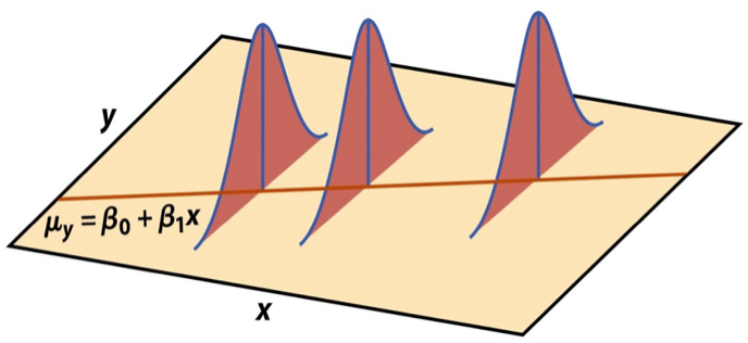
Image source: Introduction to the Practice of Statistics (5th ed)
Model conditions
Model conditions
- Linearity: There is a linear relationship between the outcome and predictor variables
- Constant variance: The variability of the errors is equal for all values of the predictor variable
- Normality: The errors follow a normal distribution
- Independence: The errors are independent from each other
WARNING
- Many of these assumptions are for the population
- We want to determine whether they are met from your data
- In real life, these conditions are almost always violated in one way or another
- Questions you should ask yourself:
- Are my conditions close enough to being satisfied that I can trust the results of my inference
- Do I have reason to believe that my conditions are GROSSLY violated?
- Based on what I see, how trustworthy do I think the results of my inference are.
ENGAGE: SOAP BOX
Statistics and numbers are often used to make arguments seem more “rigorous” or infallible. I’m sure you’ve heard the phrase “the numbers are the numbers” or “you can’t argue with the numbers”. More often than not, this is BULLSHIT. Most data analyses involve making decision which are subjective. The interpretability of any form of statistical inference is heavily influenced by whether the assumptions and conditions of that inference is met, which they almost never are. It is up to the practitioner to determine whether those conditions are met and what impact those conditions have on the results of those analyses. In my work, I rarely encounter practitioners who even know what the conditions are, let alone understand why they are important. FURTHERMORE!!! the quality of your analysis is only as good as the quality of your data. Remember a crap study design will yield crap data which will yield crappy analysis. Statistical analyses yield one important form of evidence which should be combined with other forms of evidence when making an argument.
Linearity
If the linear model, \(\hat{Y} = \hat{\beta}_0 + \hat{\beta}_1X\), adequately describes the relationship between \(X\) and \(Y\), then the residuals should reflect random (chance) error
To assess this, we can look at a plot of the residuals (\(e_i\)’s) vs. the fitted values (\(\hat{y}_i\)’s) or predictors(or \(x_i\)’s)
There should be no distinguishable pattern in the residuals plot, i.e. the residuals should be randomly scattered
A non-random pattern (e.g. a parabola) suggests a linear model that does not adequately describe the relationship between \(X\) and \(Y\)
Linearity
✅ The residuals vs. fitted values plot should show a random scatter of residuals (no distinguishable pattern or structure)

The augment function
augment is from the broom package:
| danceability | duration_min | .fitted | .resid | .hat | .sigma | .cooksd | .std.resid |
|---|---|---|---|---|---|---|---|
| 0.733 | 2.464000 | 0.7212126 | 0.0117874 | 0.0057228 | 0.1304132 | 0.0000237 | 0.0907334 |
| 0.630 | 3.258650 | 0.7019569 | -0.0719569 | 0.0021749 | 0.1303749 | 0.0003332 | -0.5529036 |
| 0.877 | 3.864133 | 0.6872849 | 0.1897151 | 0.0024253 | 0.1301401 | 0.0025838 | 1.4579193 |
| 0.831 | 3.674783 | 0.6918732 | 0.1391268 | 0.0020725 | 0.1302669 | 0.0011866 | 1.0689702 |
| 0.668 | 2.650183 | 0.7167011 | -0.0487011 | 0.0044968 | 0.1303962 | 0.0003170 | -0.3746465 |
| 0.626 | 3.377017 | 0.6990886 | -0.0730886 | 0.0020230 | 0.1303736 | 0.0003196 | -0.5615572 |
Residuals vs. fitted values (code)
Non-linear relationships


Violations of Linearity
- Impact: inference relies on estimates of \(\sigma_\epsilon\) computed from residuals:
- Residuals will be larger in certain places so estimates will be inaccurate
- Therefore, inference (i.e. CIs and p-values) will be inaccurate
- Most importantly… your predictions will be wrong most of the time
- Remedy: transform your data (to come)
Complete Exercises 1-3
Constant variance
If the spread of the distribution of \(Y\) is equal for all values of \(X\) then the spread of the residuals should be approximately equal for each value of \(X\)
To assess this, we can look at a plot of the residuals vs. the fitted values
The vertical spread of the residuals should be approximately equal as you move from left to right
CAREFUL: Inconsistent distribution of \(X\)s can make it seem as if there is non-constant variance
Constant variance
✅ The vertical spread of the residuals is relatively constant across the plot

Non-constant variance: Fan-Pattern


- Constant variance is frequently violated when the error/variance is proportional to the response variable
- Whose wealth fluctuates more per day… Dr. Friedlander’s or Elon Musk’s?
Violations of Constant Variance
- Impact: inference relies on estimates of \(\sigma_\epsilon\) computed from residuals:
- Residuals will be larger in certain places so estimates will be inaccurate
- Therefore, inference (i.e. CIs and p-values) will be inaccurate
- Remedy: transform your data (to come)
Complete Exercises 4
Normality
The linear model assumes that the distribution of \(Y\) is Normal for every value of \(X\)
This is impossible to check in practice, so we will look at the overall distribution of the residuals to assess if the normality assumption is satisfied
A histogram of the residuals should look approximately normal, symmetric, without any huge outliers
A normal QQ-plot falls along a diagonal line
Most inferential methods for regression are robust to some departures from normality, so we can proceed with inference if the sample size is sufficiently large, roughly \(n > 30\) depending on how non-normal your residuals look
- Notable exception: predictions intervals!
Check normality using a histogram

Check normality using a QQ-plot

\(x\)-axis: quantile we would expect from a true normal distribution
\(y\)-axis: quantile we observe in the data
Bell-shaped does not necessarily equal normal… QQ-plot can detect distributions with heavier (i.e. more spread out) tails than a normal distribution
Check normality using a QQ-plot


Assess whether residuals lie along the diagonal line of the Quantile-quantile plot (QQ-plot).
If so, the residuals are normally distributed.
Note: QQ-Plots are pretty sensitive so it doesn’t take too much departure to conclude non-normality
Normality
❌ The residuals do not appear to follow a normal distribution, because the points do not lie on the diagonal line, so normality is not satisfied.
✅ The sample size \(n = 508> 30\), so the sample size is large enough to relax this condition and proceed with inference (mostly).
Violations of Normality
- Impact: depends what you want to do and how large your sample size is
- Your predictions intervals will be wrong… they will be symmetric when they shouldn’t be…
- If you have a large sample size not a big deal for anything else
- Remedy… depends on what you want to do
- If sample size is large enough and don’t care about prediction intervals… do nothing
- Otherwise, transform data… (hard for small sample sizes)
Complete Exercises 5 and 6.
Independence
We can often check the independence assumption based on the context of the data and how the observations were collected
Two common violations of the independence assumption:
Temporal Correlation: If the data were collected over time, plot the residuals in time order to see if there is a pattern (serial correlation)
Cluster Effect: If there are subgroups represented in the data that are not accounted for in the model, you can color the points in the residual plots by group to see if the model systematically over or under predicts for a particular subgroup
Spatial Correlation: If observations that were close to one another are more correlated than ones which are far apart then independent is violated
Independence
Complete Exercise 7
❌ Based on the information we have, it’s unlikely the data are independent.
Violations of Independence
- Impact: depends on how it’s violated
- In some cases you’ll underestimate p-values (too many false positives) and make CIs which are too narrow
- In other cases you’ll do the opposite
- Remedy… depends on the source and type of dependence
- Add variable accounting for dependence to model
- Otherwise, beyond the scope of this class
- Time-Series Analysis
- Mixed-Effects Models
- Spacial Statistics
Model evaluation
Partitioning Variability
Let’s think about variation:
- DATA = MODEL + ERROR
- \(\substack{\text{Variation} \\ \text{in Y}} = \substack{\text{Variation explained} \\ \text{by model}} + \substack{\text{Variation not explained} \\ \text{by model}}\)
Partitioning Variability (ANOVA)
- \(y_i - \bar{y} = (\hat{y}_i - \bar{y}) + (y_i-\hat{y}_i)\)
- Square and sum: \(\sum(y_i-\bar{y})^2 = \sum(\hat{y} - \bar{y})^2 + \sum(y-\hat{y})^2\)
- \(\substack{\text{Sum of squares} \\ \text{Total}} = \substack{\text{Sum of squares} \\ \text{model}} + \substack{\text{Sum of squares} \\ \text{error}}\)
- \(SSTotal = SSModel + SSE\)
- \(SST = SSM + SSE\)
ANOVA in R
| term | df | sumsq | meansq | statistic | p.value |
|---|---|---|---|---|---|
| duration_min | 1 | 0.1685294 | 0.1685294 | 9.928516 | 0.0017237 |
| Residuals | 506 | 8.5889829 | 0.0169743 | NA | NA |
- More on this later in the semester
- Complete Exercise 8.
Recall: Correlation Coefficient
- The correlation coefficient, \(r\), is a number between -1 and +1 that measures how strong the linear relationship between two variables \(x\) and \(y\) is.
\[ r = \frac{\sum(x_i - \bar{x})(y_i-\bar{y})}{\sqrt{\sum(x_i-\bar{x})^2\sum(y_i-\bar{y})^2}} = \frac{\sum(x_i - \bar{x})(y_i-\bar{y})}{s_xs_y} \]
Two statistics: \(R^2\)
- R-squared, \(R^2\), Coefficient of Determination : Percentage of variability in the outcome explained by the regression model (in the context of SLR, the predictor) \[
R^2 = Cor(y, \hat{y})^2
\]
- Also called PRE (Percent Reduction in Error) because: \[ R^2 = \frac{SSModel}{SSTotal} \]
Two statistics: RMSE
- Root mean square error, RMSE: A measure of the average error (average difference between observed and predicted values of the outcome) \[
RMSE = \sqrt{\frac{\sum_{i = 1}^n (y_i - \hat{y}_i)^2}{n}}
\]
- Sometimes people just case about numerator (SSE) or version without the square-root (MSE)
- Sometimes the denominator may have \(n-1\) instead
What indicates a good model fit? Higher or lower \(R^2\)? Higher or lower RMSE?
\(R^2\)
- Ranges between 0 (terrible predictor) and 1 (perfect predictor)
- Has no units
- Calculate with
rsq()fromyardstickpackage using the augmented data:
Interpreting \(R^2\)
🗳️ Discussion
The \(R^2\) of the model for danceability from Average_Income_K is 1.9%. Which of the following is the correct interpretation of this value?
duration_mincorrectly predicts 1.9% ofdanceability.- 1.9% of the variability in
danceabilitycan be explained byduration_min. - 1.9% of the variability in
duration_mincan be explained bydanceability. - 1.9% of the time
danceabilitycan be predicted byduration_min.
Complete Exercise 9.
Activity
In groups, at the board, design a simulation-based procedure for producing a p-value for the following hypothesis test.
- \(H_0: R^2 = 0\)
- \(H_A: R^2 \neq 0\)
RMSE
Ranges between 0 (perfect predictor) and infinity (terrible predictor)
Same units as the response variable
Interpretation (kind of): how much does my model miss by, on average.
Calculate with
rmse()fromyardstickpackage using the augmented data:
# A tibble: 1 × 3
  .metric .estimator .estimate
  <chr>   <chr>          <dbl>
1 rmse standard 0.130- Complete Exercise 10.
Using the word “Good”
- There is no such thing as a “Good” \(R^2\) or, especially, RMSE without context
- Whether your model is a “Good” model depends on many things:
- What are you using your model for?
- How good are other models?
Recap
Used residual plots to check conditions for SLR:
- Linearity (residuals vs fitted vals)
- Constant variance (residuals vs fitted vals)
- Normality (histogram/QQ-plot of residuals)
- Independence (knowledge of data collection)
Note: Predictions are still valid as long as linearity is met but p-values and CIs are not without other three
- Can decompose total variation (SST) into variation explained by the model (SSM) and leftover variation (SSE)
- Two metrics for evaluating and comparing models:
- \(R^2\): What proportion of the variation in the response variable is explained by the model?
- \(RMSE\): How far is does my model miss by on average?